Jewelry, Product, & Branding Design


Friendly Folk, an e-commerce store selling colorful jewelry & home goods, was born out of my love of nature, folk art, midcentury design, slow fashion, and woodworking.
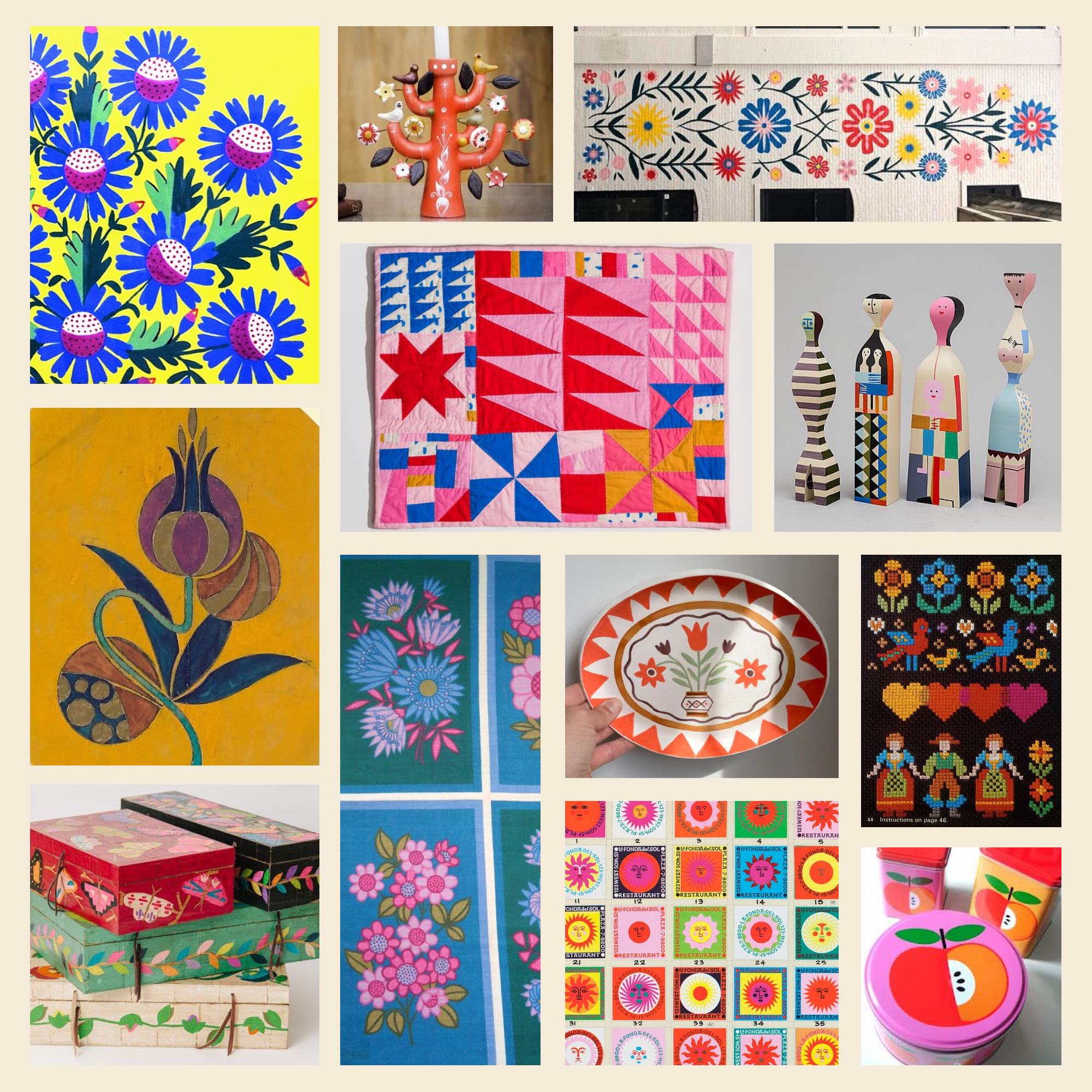
Mood Board
I grew up with Polish Pisanki on my dresser (beautifully handpainted Polish Easter eggs) and German Erzgebirge (simple, well designed wooden German toys), which helped influence my love of folk art and handmade things. Friendly Folk pulls from my German and Polish roots but contemporizes them. It’s no wonder I grew fond of Alexander Girard, a midcentury designer also inspired by folk art, whose work is also featured on the mood board below.
Friendly Folk’s brand is playful, bursting with unexpected color, self-assured, and inviting. My goal is to create affordable but well-designed and high-quality products that give you a boost of dopamine. This is a brand for adults who crave color and whimsy but love to be surrounded by good design.
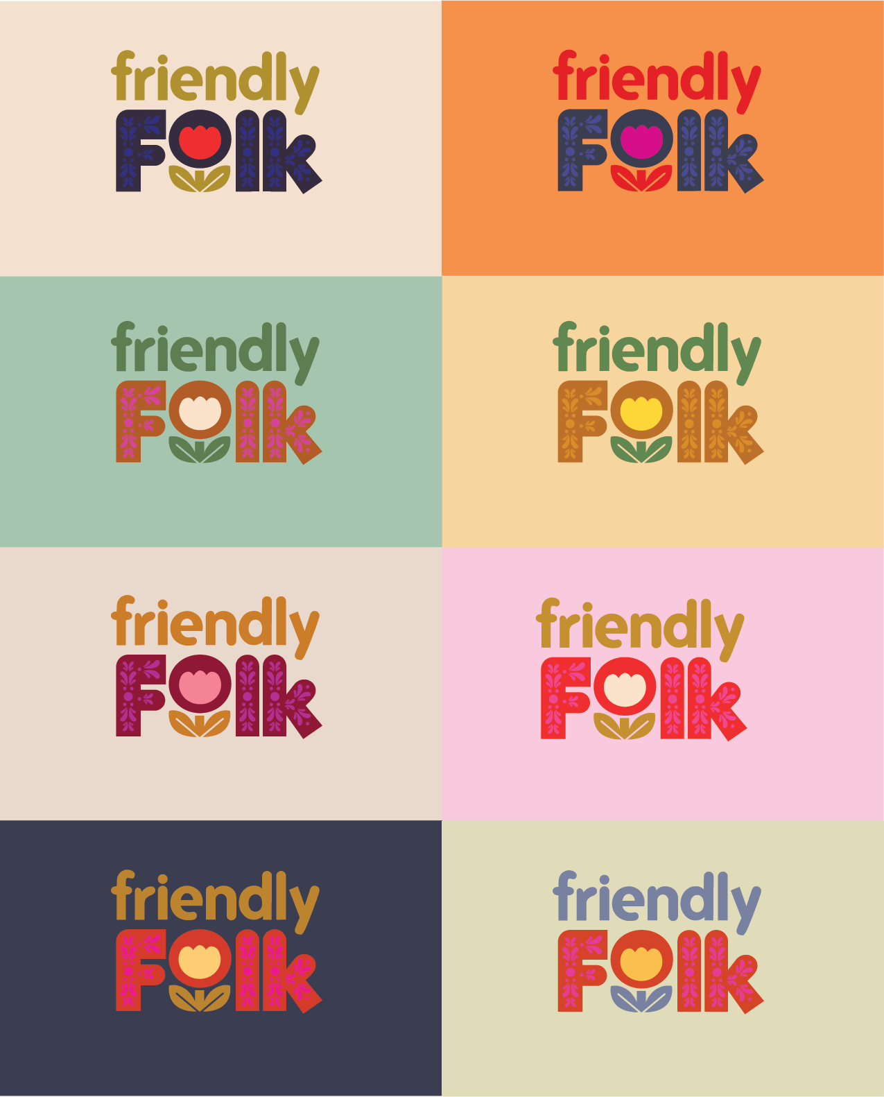
Logo Exploration & Colorways
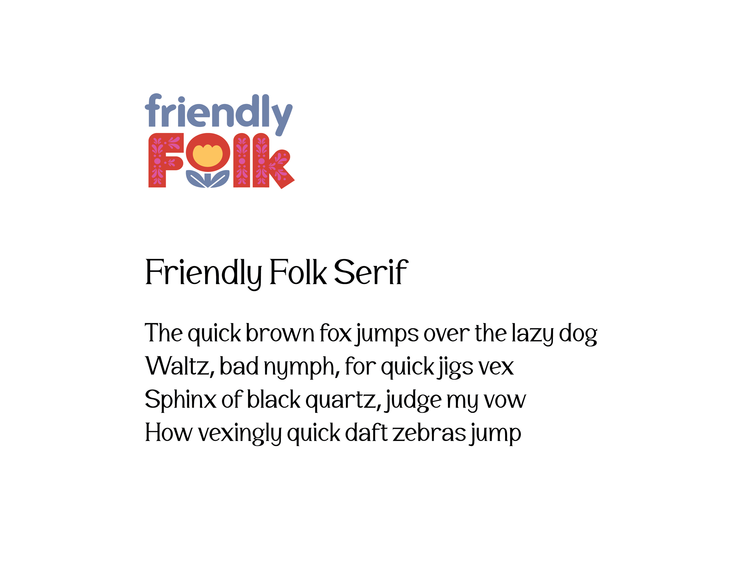
Branding Guide

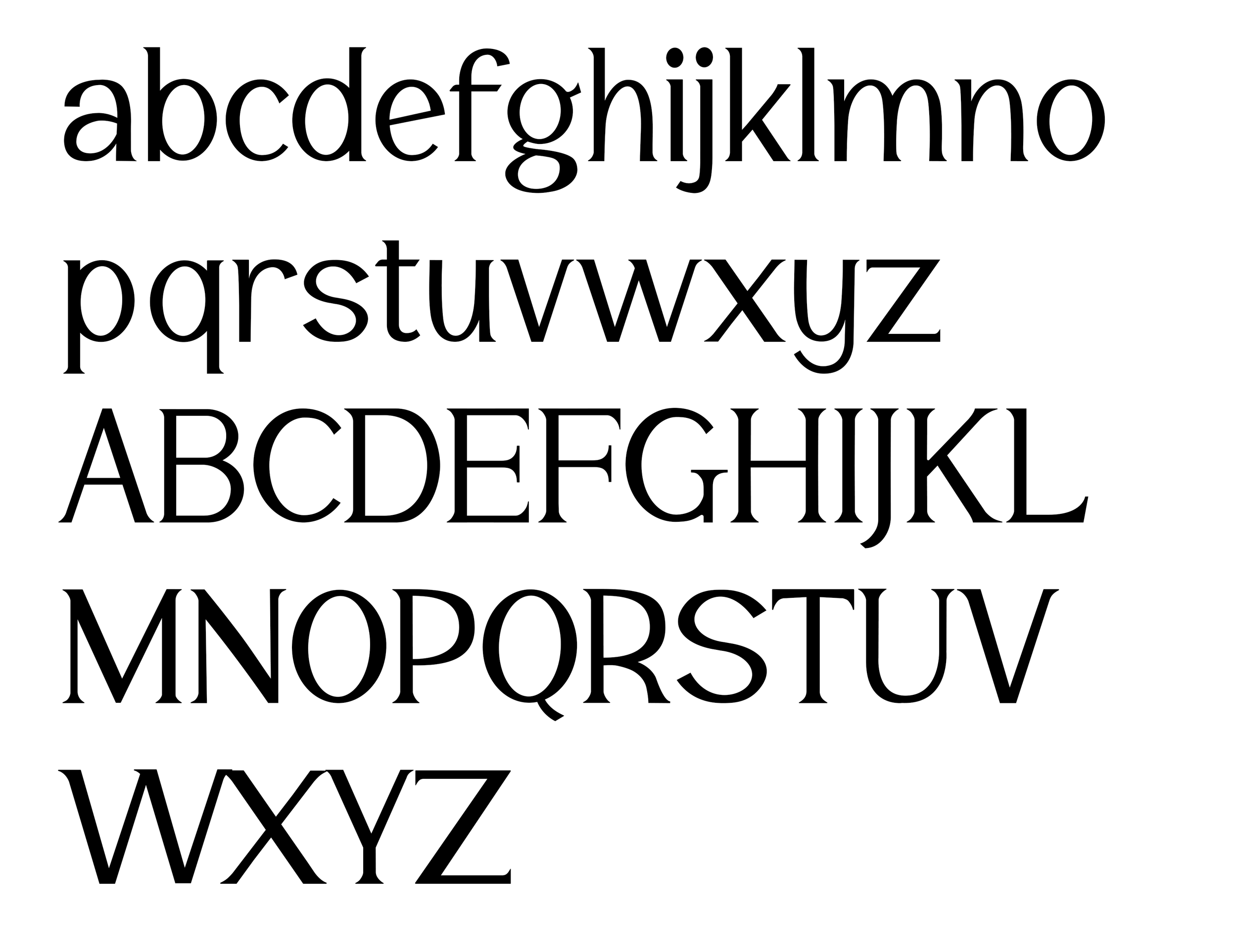
Custom Font
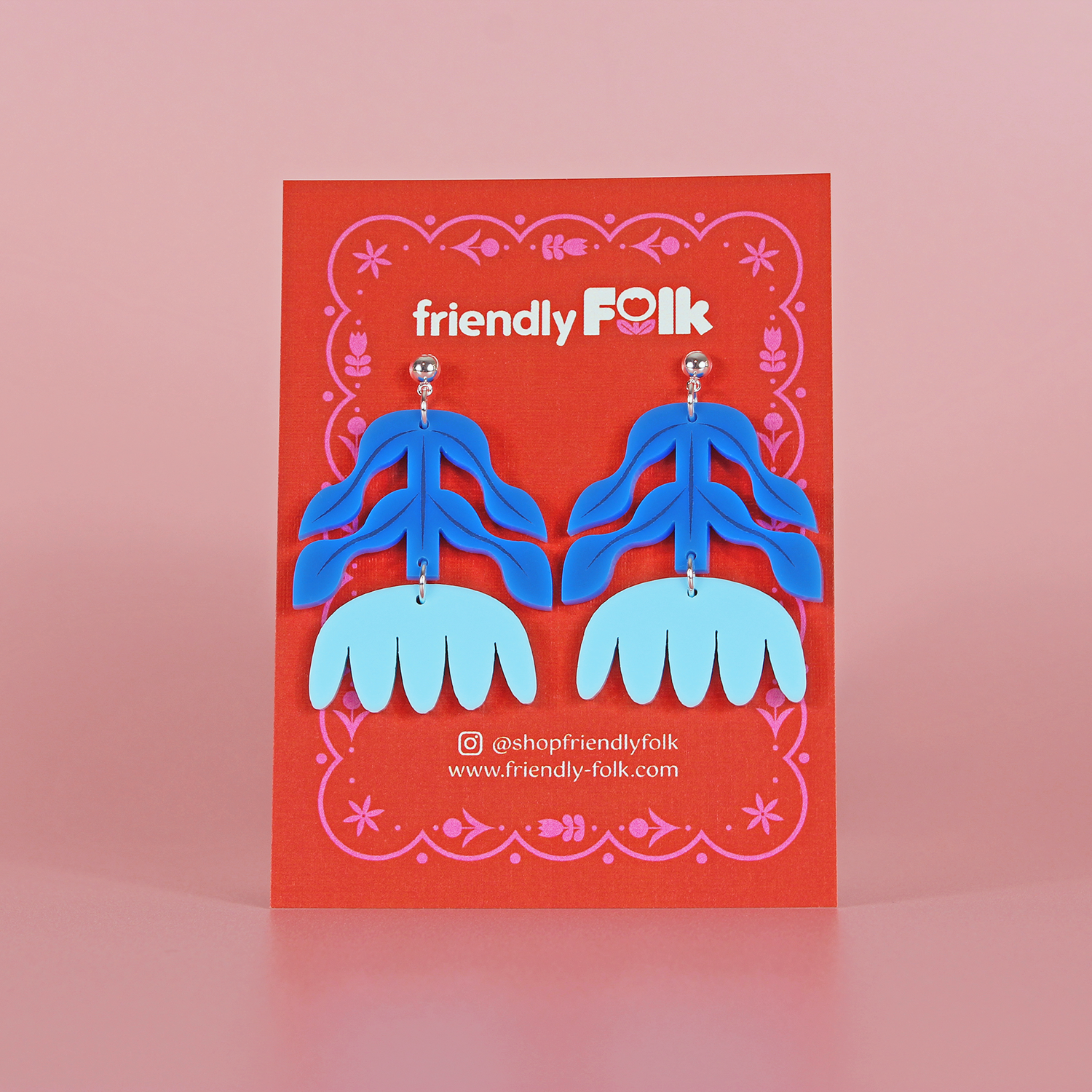
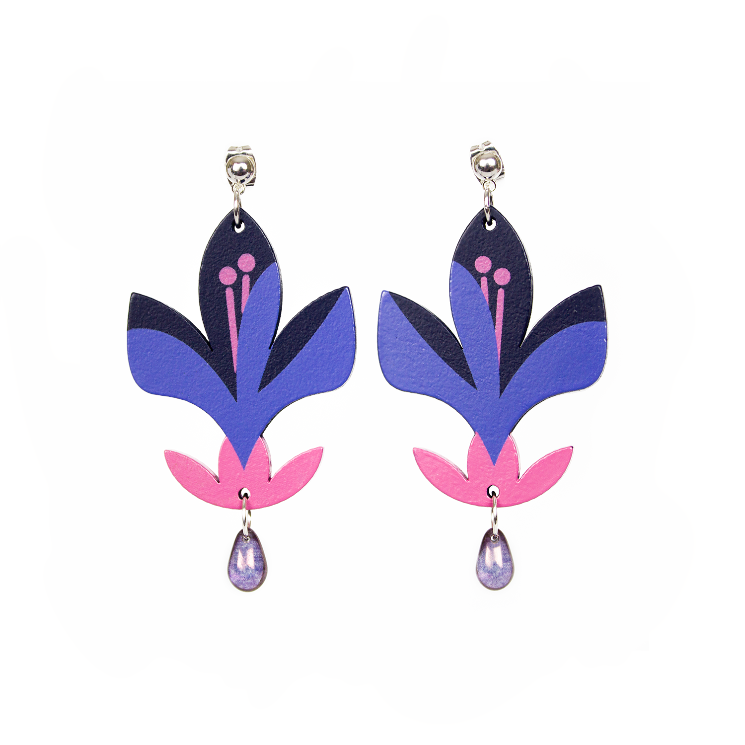
Products
Responsible for product design, manufacturer sourcing, package design, tech sheets, product photography, and photo editing.


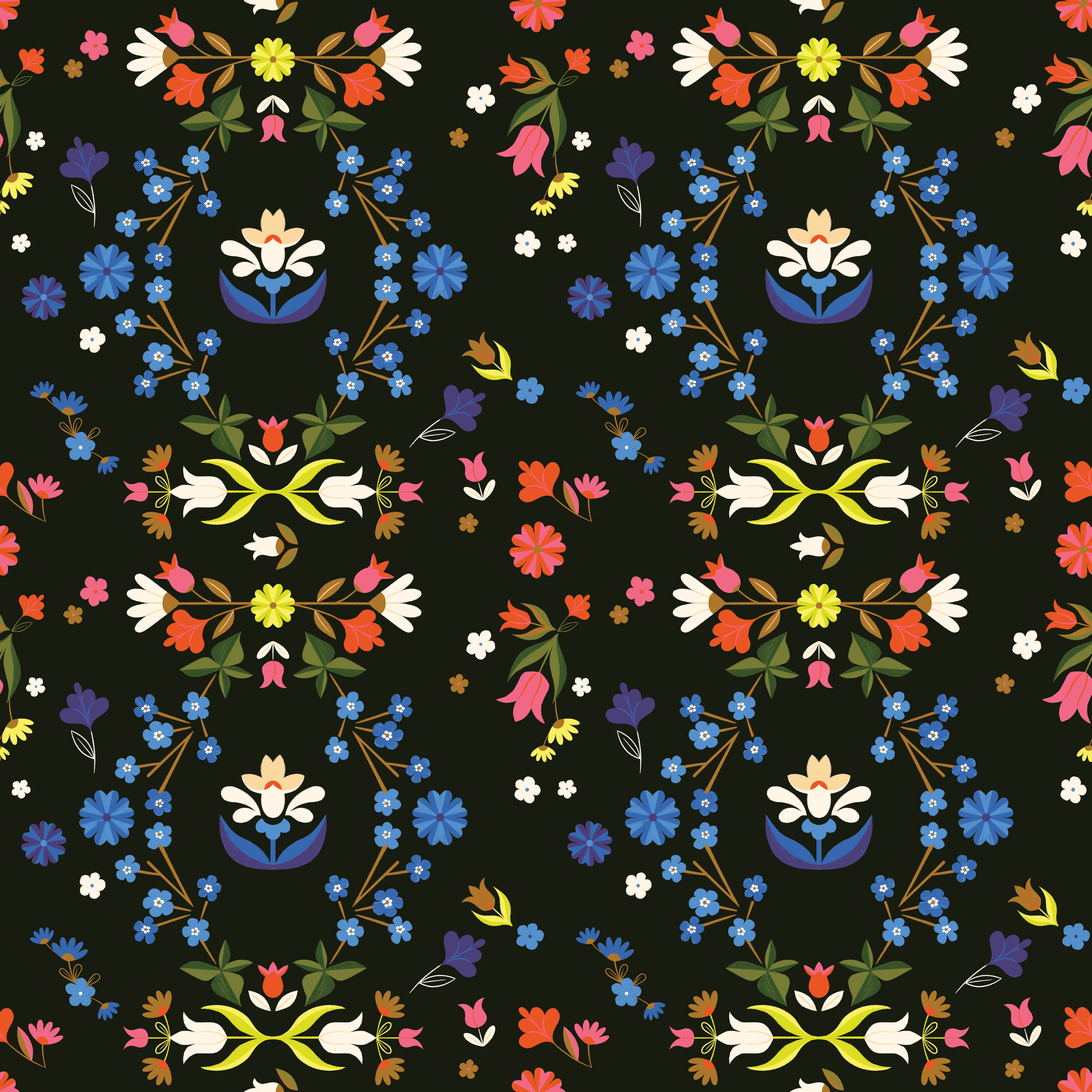
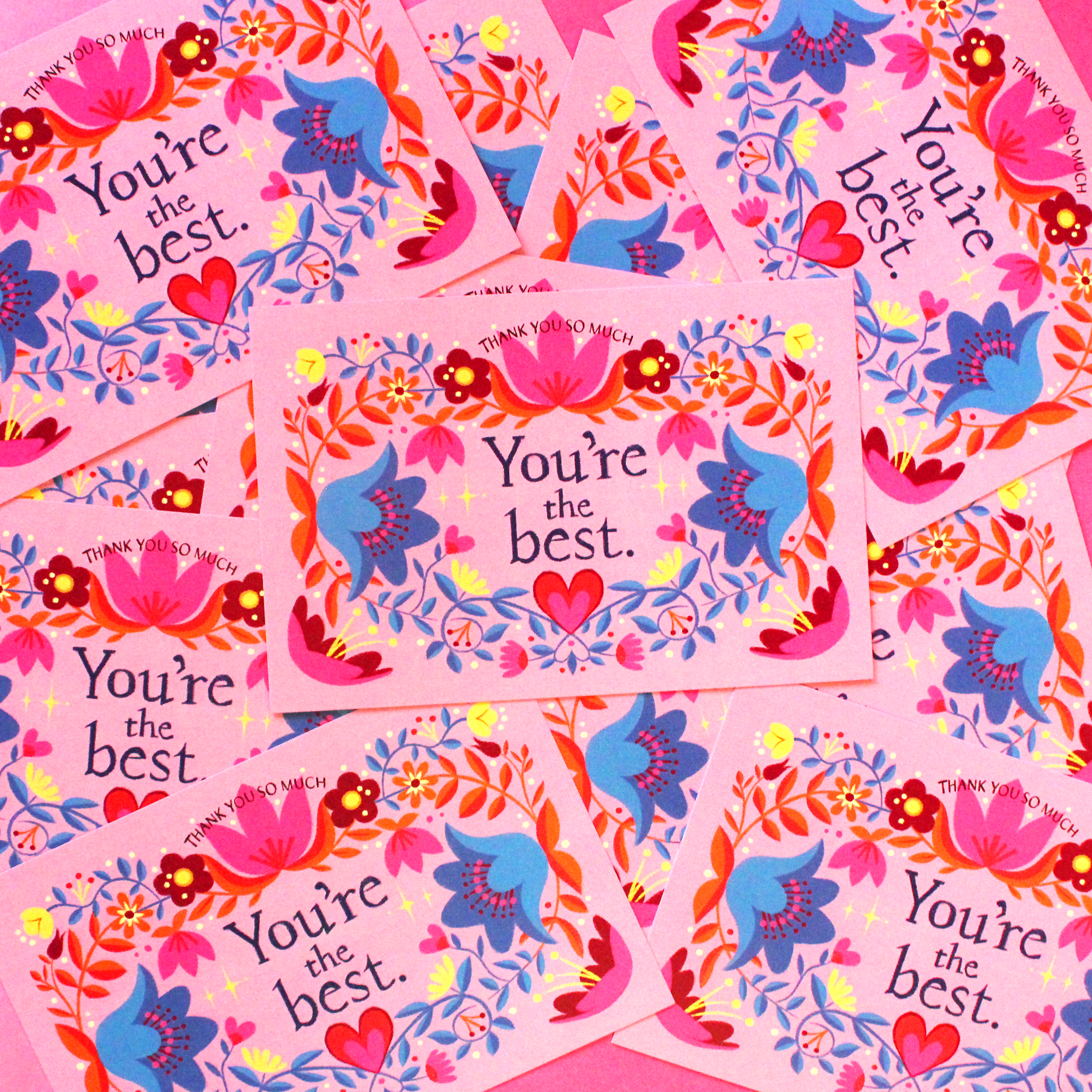
Patterns
Repeating pattern designs created in Illustrator & Photoshop. Used in packaging, products, and digital advertising. Utilizing the brand’s folk art motifs, bold sense of color, and whimsicality.


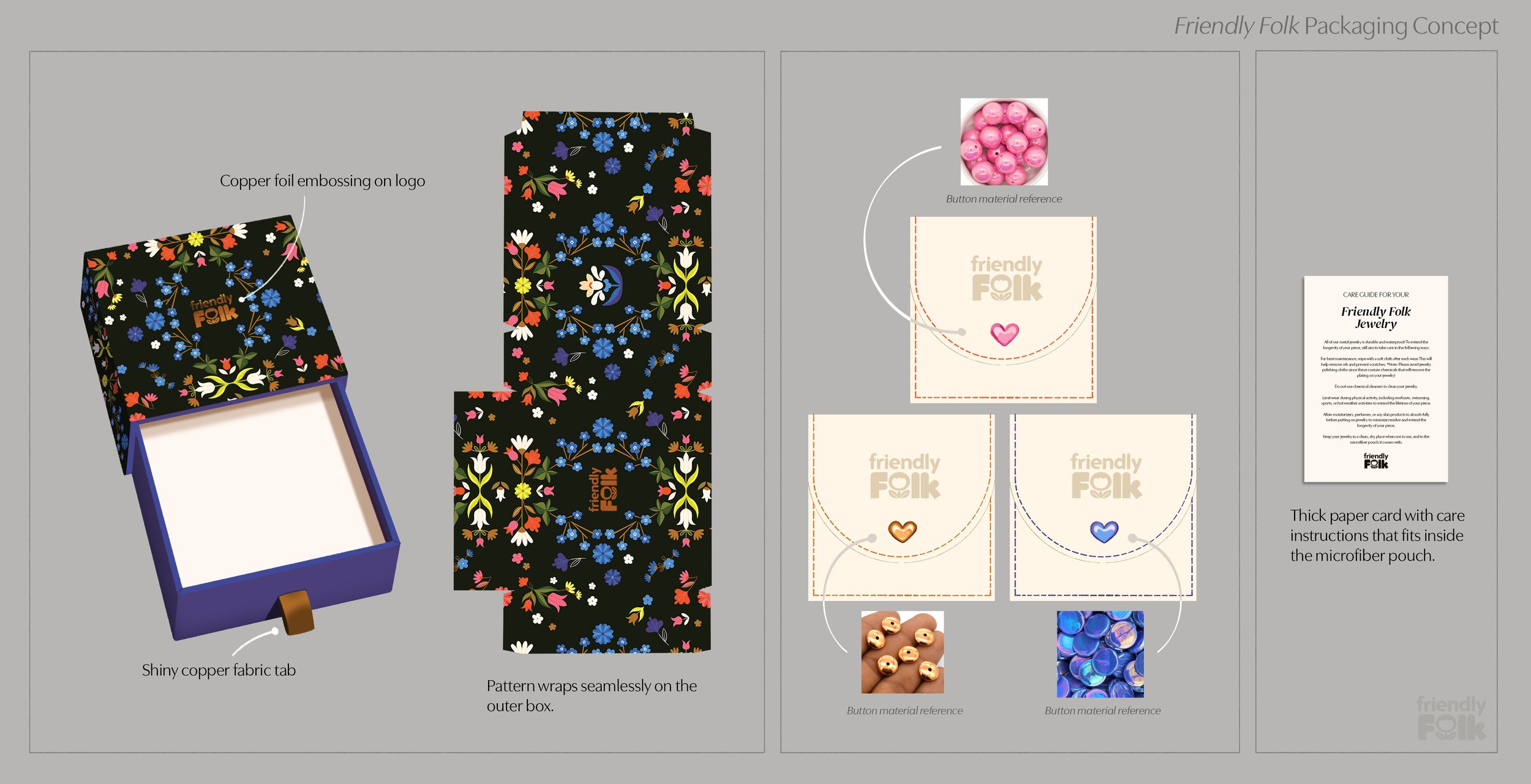
Packaging
Digital Assets


(Above) The site’s header. Painted with acrylic paint on canvas paper, then photographed with the products. I love utilizing traditional mediums for digital design, especially for a brand rooted in art and craftsmanship.
(Above) Product feature illustrations for the website’s front page. Created as vector graphics in Illustrator.

(Above) Spot illustrations for use across the site.