We Baby Bears - Art Direction
2020-2024

Special Pose by Aleth Romanillos
I joined We Baby Bears, an adorable spinoff series to We Bare Bears, in July of 2020, partway through the beginning of production. I was super excited to hit the ground running on an extraordinarily cute and anime-inspired show, pulling from the nostalgic 90’s anime of my youth.
We Baby Bears is a travelling show where in each episode we designed a whole new world of locations and characters. Travelling shows are notoriously challenging, but this one made my eyes sparkle; Every episode is a chance to explore our style and push our color palettes, research and find clever design solutions, and make something super gorgeous over and over again. And I think we did just that!
Below is a sample of my work from my time on the 2 seasons of Baby Bears, including Colorscripts from when I first came on board (before our incredible Color Supervisor Melissa King joined), and the first background I designed & painted to help further establish the show style.
Also included are final backgrounds, character designs, color designs, and props, all beautifully designed by the stellar artists on my team who I’ve noted below.

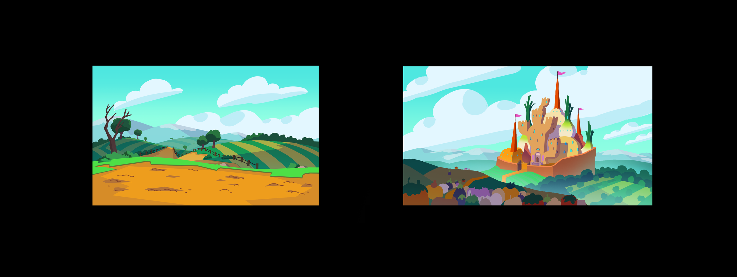
SEASON ONE - Selected Color Scripts
My Colorscripts for the first couple episodes in Season One.
Since the Bears are trying to find a home, each episode’s location was meant to feel like a place you’d want to live and hang out in. Even a house of made meat should be designed to feel strangely appealing and inviting. Strong and alluring color was key to creating new and exciting kinds of places, ones that draw the Bears in over and over again.


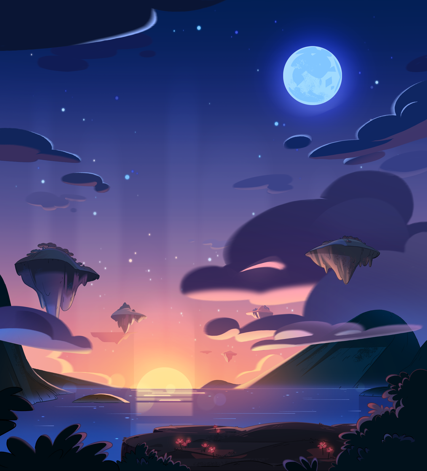
The first background I designed and painted for We Baby Bears.
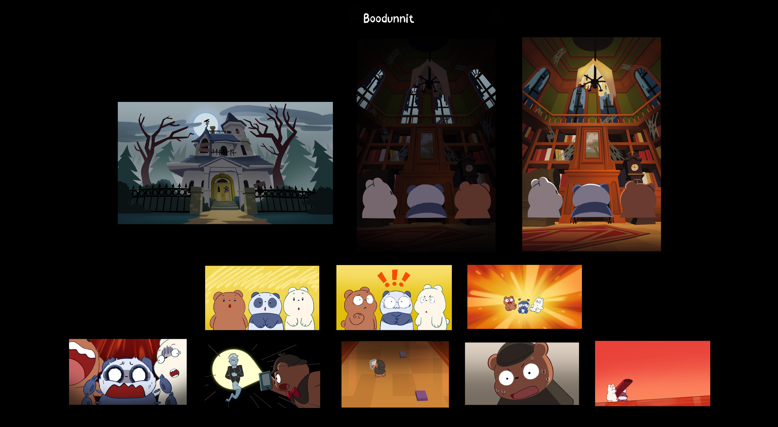
Storyboards to Final Picture
Examples of final shots from episodes compared to their locked storyboard panels, demonstrating the complete visual direction for various episodes.
ICE BEAR’S PET
Season One, Episode 22


Background Design & Paint
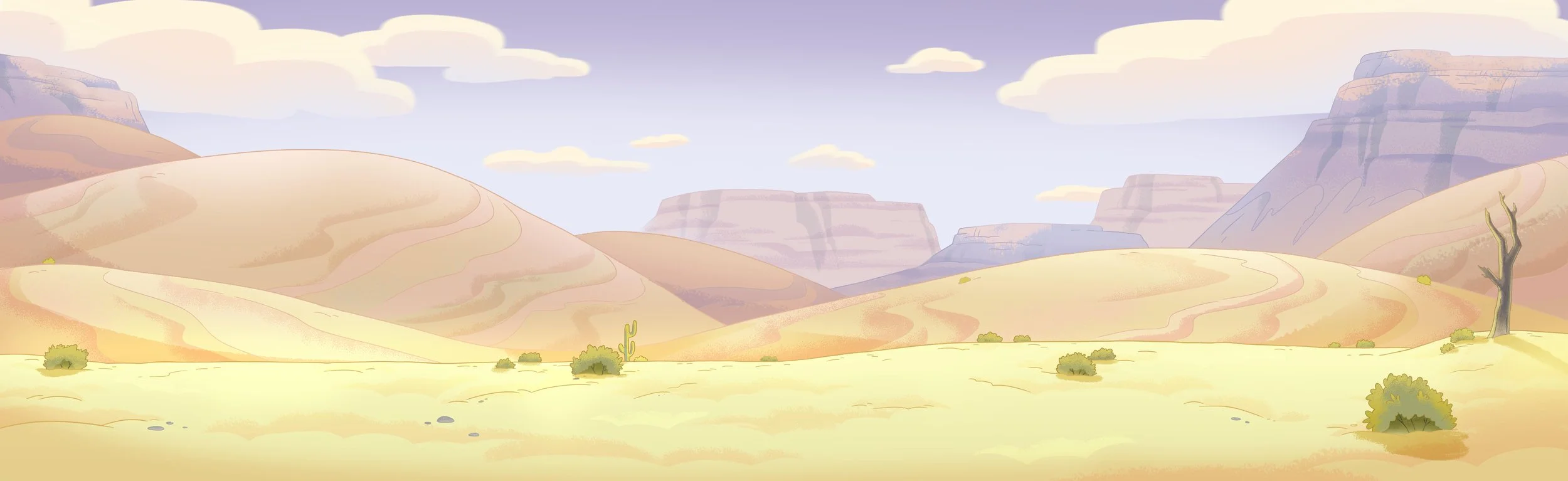
Selected final backgrounds from all seasons of We Baby Bears.


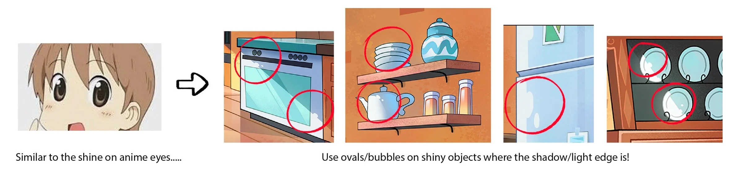
A snippet from the background paint style guide I created at the beginning of production.
Using Research to Find a Unique Visual Solution
One of my favorite parts of art directing is doing research, especially for a series so based in traveling to new and exciting worlds. Considering the story and its thematic elements, research is done to uncover unexpected points of reference in order to create something new. The best visual direction is creative problem solving, and research helps solve the puzzle.
Each episode’s art direction started out with a meeting with our showrunner(s), the episode’s director, and our art leads to exchange ideas for visual direction. Using our showrunner(s)’ and director’s visions, research, and reference (from the board stage) as a launching point, I dove into more specific exploration needed for each discipline (color, design, lighting, etc.). Working collaboratively to share what we’ve discovered and bounce ideas back and forth enriches the story even further and is such a fun part of the process.
Below are a couple of abbreviated demonstrations of how research was translated into the art direction of an episode.
A GROSS WORM
Season 1, Episode 28
The storyboard artists already did an incredible job describing the weird, alien environment in this episode, which gave the art department a great starting point. Below are some of the episode’s board panels that depict the established world-building.

The environment was meant to reflect and exaggerate the gross-ness of the worm that attaches to Panda. The shape language is gloopy, blobby, weird and unfamiliar. All of this enhances Panda’s discomfort with the situation. Despite the yuckiness, our worlds are still beautiful and invite exploration. How do we make something gross still gorgeous?
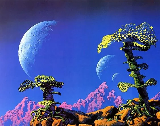
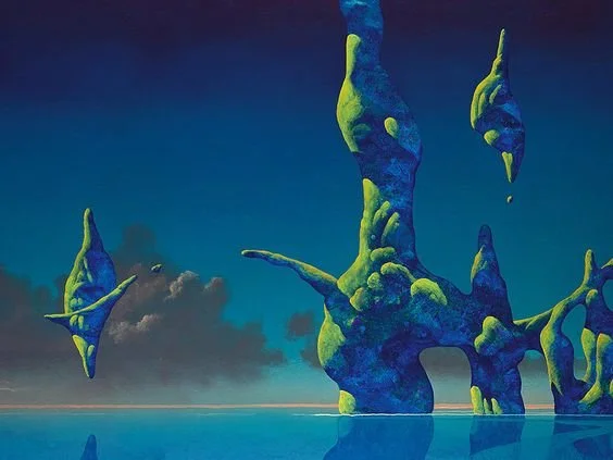
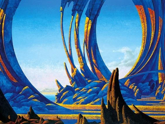
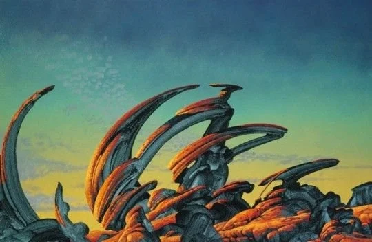
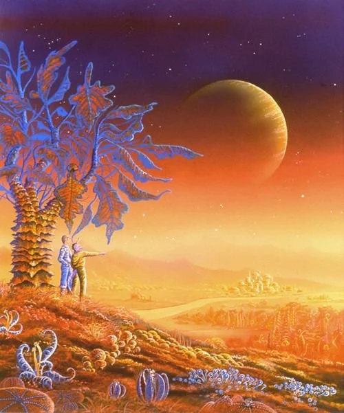
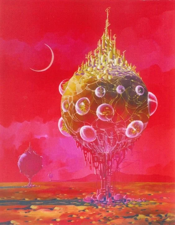
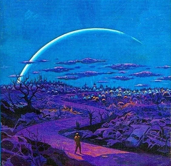
70’s Sci-Fi Art
Art by Tim White, Roger Dean, Michael Böhme, and Steve Dodd all capture odd and beautiful color palettes, otherworldly vegetation and natural structures, and a great sense of exaggerated scale. Their illustrations aren’t so overwhelmed with detail like a lot of contemporary sci-fi art can be, but instead utilize strong framing devices to capture your eye. There’s a playfulness in their work that matches the attitude of We Baby Bears as well. These illustrations became great inspiration for us!

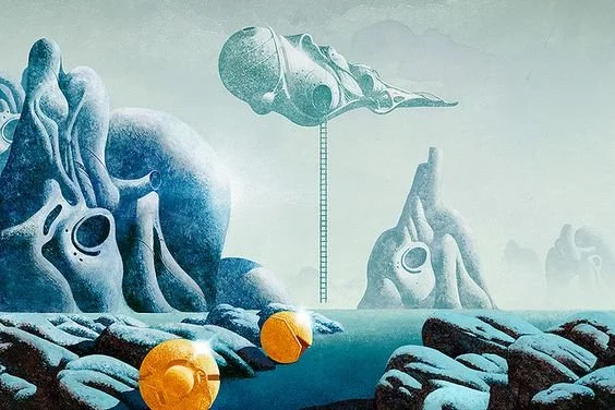
Moebius
A fairly obvious point of reference, but how could we not? We were drawn to the weird and gloopy forms, how everything feels like it’s in motion, and not knowing if anything in this world is safe to touch.

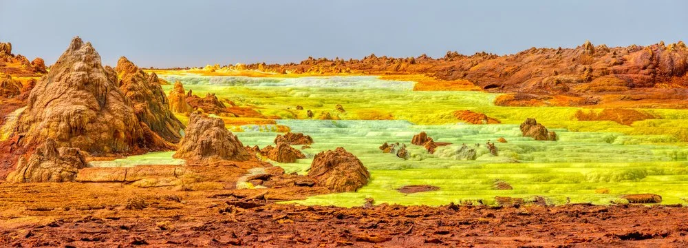
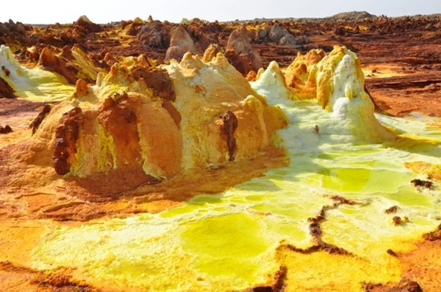
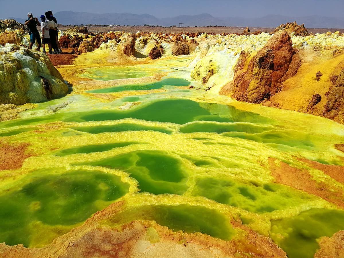
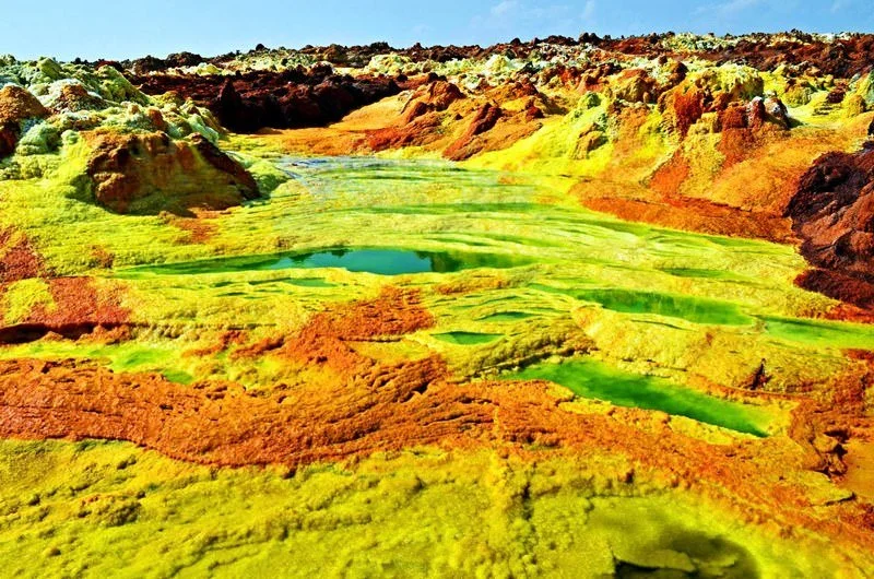
Real World Inspiration - The Danakil Depression in Ethiopia
Nature can be insane and more other-worldly looking than you’d think! One of my favorite places to look for real-life inspiration is offbeat travel sites like Atlas Obscura, where I discovered The Danakil Depression, a super hot environment with acidic springs. We loved the neon yellows and played with incorporating them into this episode’s color palette.


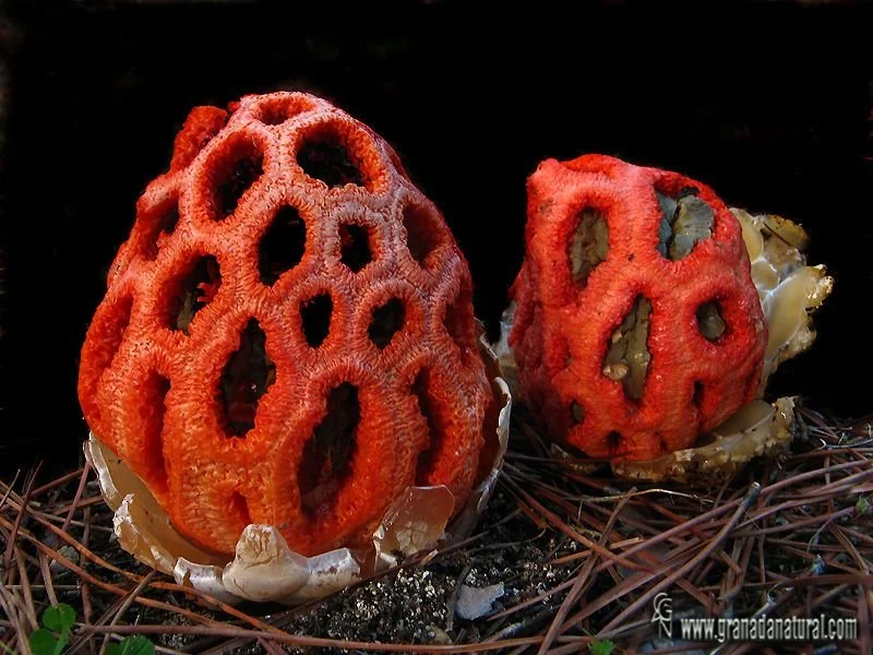
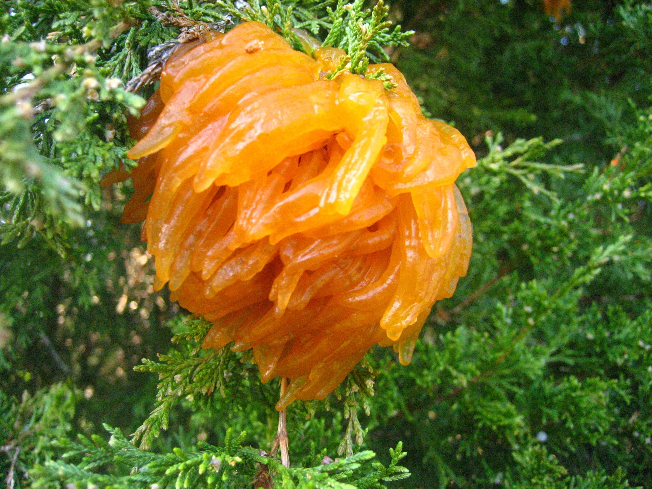
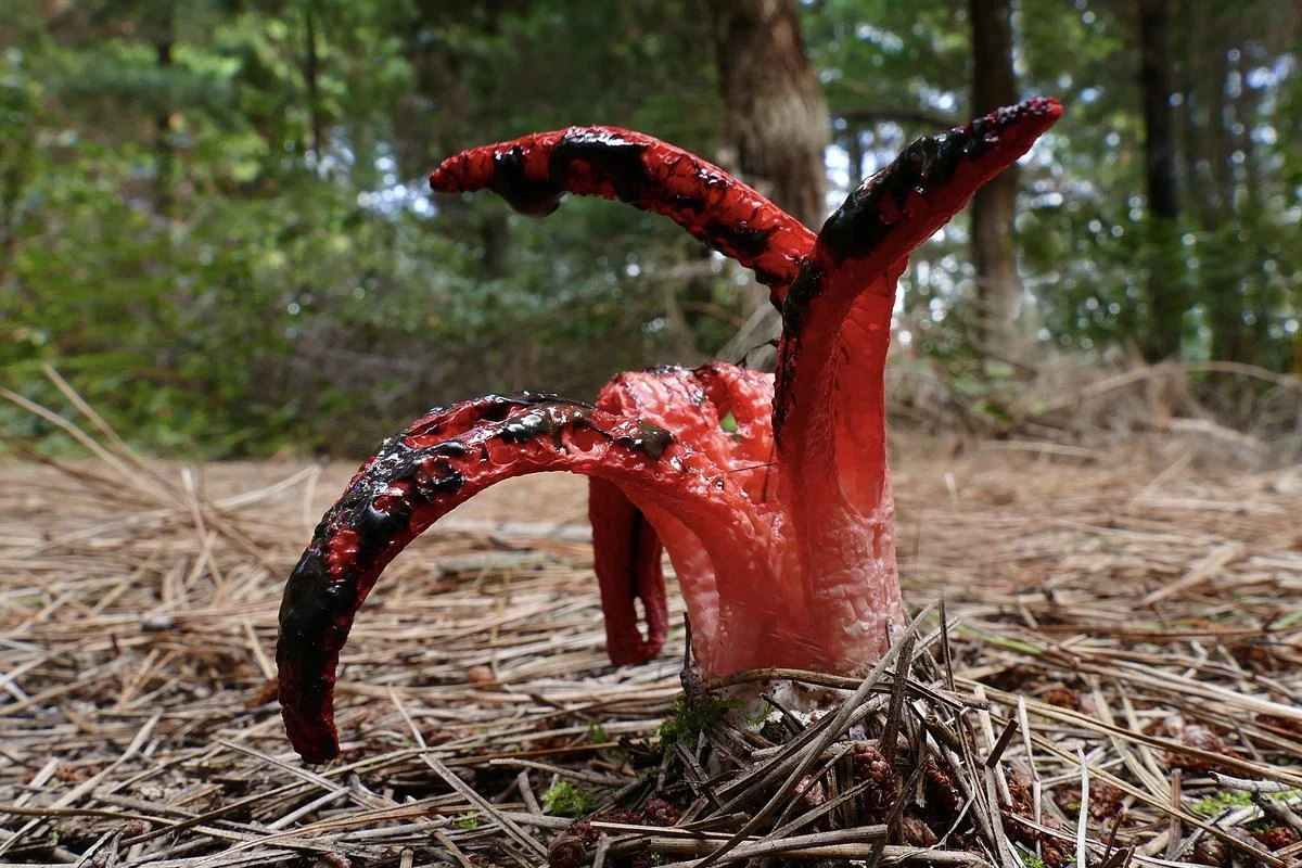
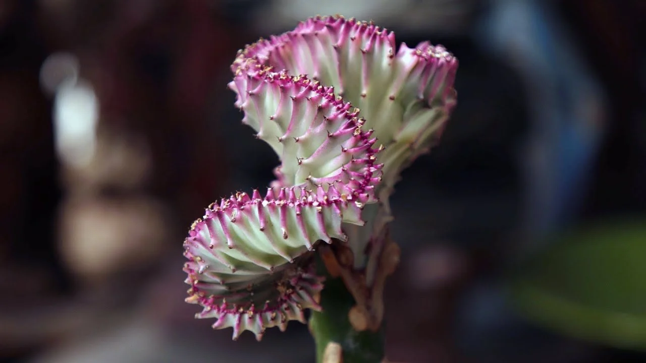
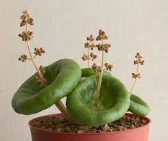
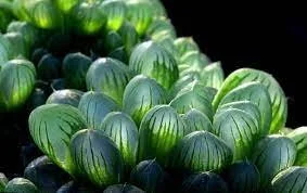
Real World Inspiration - Terrifying and Strange Plants
My apologies in advance for showing you these horrific images, but again, nature can be crazy. We of course made the foliage in our alien world cuter and more Baby-Bears-esque, but used these terrible plants as points of reference. That tentacle-looking plant is called an Octopus Stinkhorn and apparently has a strong smell. I hate it.

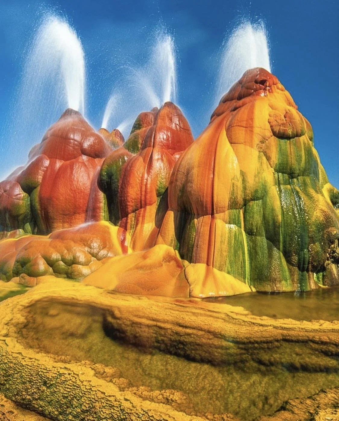
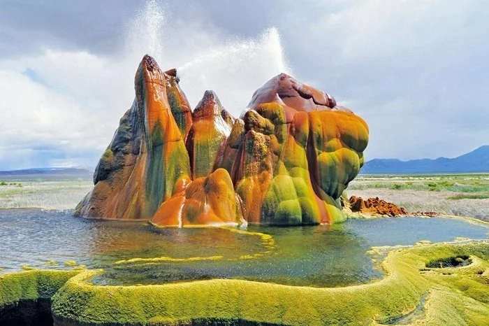
Real Life Inspiration - Fly Ranch Geyser, Nevada
Another on the list of uncomfortable forms in nature is this geyser in Nevada. Similar to the acidic springs in Ethiopia, the Fly Ranch Geyser is rotund and bubbly in shape. It almost feels like a bursting pimple. This felt like appropriate reference for our gross alien world.
Despite its bulbousness, the color of this geyser is gorgeous and doesn’t feel real. I also love the contrast in the round, vertical geyser forms against the long, flat stacks of land and water beneath it. Nature is pretty good at design.